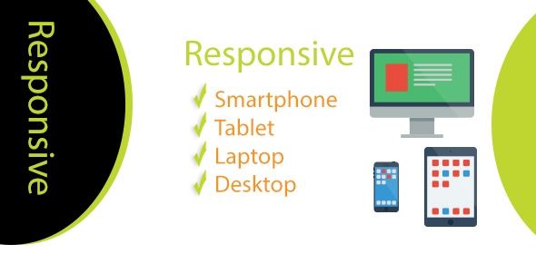
How Important is Responsive Design?
Responsive Website Design, often shortened to RWD, is a design approach that takes into account the vast multitude of devices capable of displaying a website.
Whether the device supports CSS (Cascading Style Sheets) or only HTML (Hypertext Markup Language) is a big issue that has taken a long time to resolve, previously resulting in poorly displayed websites and so reducing the quality for the user.
Of course, a poorly displayed website will drive a viewer and potential customer away. Responsive design isn’t, in fact, a new concept; JavaScript and progressive enhancement was designed specifically to use web technologies in a layered fashion, allowing access to web page basic functions and content on any browser and on any connection; at the same time it would allow the full version to go to full function devices such as PCs and laptops.
The fact that most phones and smart devices did not interpret JavaScript meant that this technology failed so a solution had to be found to create a smoother, low-effort option for the displaying of a web page. With RWD a ‘graceful degradation’ of the screen was now possible.
How does Responsive Web Design?
Instead of specifically sized objects on a web page, they are given proportions for sizing instead and therefore fit appropriately into a 5 inch screen as well as a 15 inch PC screen - mostly. Problems with the technology is that there are a large number of web pages out there that are built with banners that cannot be shrunk and frames that are rigid in style.
No matter what the technology does to receive a webpage properly, there will be limits on older sites. It is also possible to create an alternative-style page to fit into smaller devices; it is not reasonable to fit all the detail from a 15 inch screen onto a 5 inch screen. Most of us can’t read 1 point text, no matter our age!
This is all part of a standard devised by W3C (World Wide Web Consortium) whose sole purpose is to devise protocols and guidelines that ensure long-term growth of the web.
The number and type of device that users possess to provide them information on the go has increased dramatically and demanded a solution be found to reduce the effort required to display a web page. Enter the media query.
A media query is a series of true/false questions that ascertain the type and size of device requesting a page. Once determined a suitable page will be loaded to the device.
Responsive web design is critical to the future of the web. As the transmission bandwidth is much lower to a smart phone than to a PC in the home sitting on broadband, it is essential that the page not only be readable but also quick to deliver. There is almost nothing worse for a user than continually watching the circular ‘wait’ icon as a page tries to load, and when it does finish loading the page is unreadable.
Before Responsive Web Design the WWW was inherently destined to fail as it grew.

Here in Norfolk at Designtec, we are specialist responsive website designers. We will address your needs, and apply our web design methodologies to build you a quality, easy to use website that will be available and readable to all of your prospects.


