Web Usability
Anyone in the web design industry will have heard of this term, "Web Usability". It's an extremely important factor of web design and should be the top priority of any web designer. So what does "Web Usability" actually mean? Well, web usability is the ease of use of a website. This means that a website with good web usability will present it's information in a clear and concise manner so as to avoid confusing the user. Things such as easy to read fonts, clear and informative text, simple to use navigation and clean layouts are all integral to web usability. Let's have a look at the Designtec website for a moment:
Our website's home page starts out looking like this:
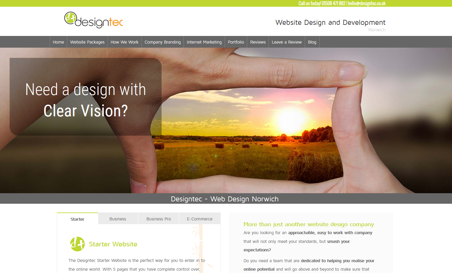
From here we can see that the navigational menu is presented straight away and in an uncluttered format. We have a series of rotating images with captions to hightlight our unique selling points and straight underneath that we have two columns of our most vital information, again, displayed in a very clear way. As the user scrolls down the page, our header and menu attach themselves to the top of the web page, but the header shrinks so as to ensure that the menu does not obstruct too much of the viewport. This allows the user to read our content and still have option to click on any page they like at any time.
Here's a screenshot of our easy to see navigation in action
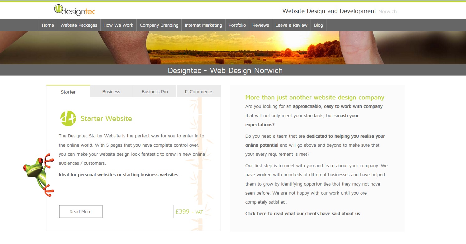
We have put all of our important information about our website packages in to a box with tabs for easy navigation of information. If this information was just put straight on without any thought, it would create a huge wall of text that the user would soon become disillusioned with, and would therefore leave the page. We display all the relevant information of a package in the main box of these tabs and include a button to take the user to the package's page for increased functionality and ease of use.
We put our text in boxes to create an easier reading experience. If text is just laid out on a plain white background, it can all blend together and feel like there is no flow to the information. Text boxes or clearly segmented background sections help to break apart sections of information, giving the reader a better understanding of when we're changing the topic or try to convey a new idea.
Let's take a look at our footer menu real quick:
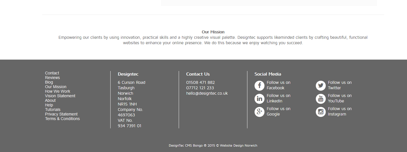
We've left nothing too close together, made sure everything is uncluttered and separated any information that would be confusing together. On the left we have a footer navigation, this links to pages that one might want to go to when they reach the bottom of any page. So here we link to relevant information about us such as our reviews, blog, terms and conditions and a "help" page for clients who want to view tutorials on how to use our content management system. We have then made our address, contact information and social media links display in a coherent way so as to present all our information clearly to the user.
You will find that planning your web usability while designing a website is intergral to keeping users and potential customers around. You can have a lovely looking website that ranks really highly in Google, but if it isn't easy to use then you aren't going to see the traffic to sales conversion that you could potentially have with a more user-friendly website.
Why do we care so much about teaching these aspects of web design?
Designtec are a web design company based near Norwich, Norfolk. We care about the success of every client and do everything that we can to ensure that their website not only looks good, but it functions smoothly and generates interest for their business. We are constantly researching the best ways to build websites so that our customers can reap the benefits. We are a web design company that does more, and we are proud of it.

